Wednesday 31 March 2010
FINAL FRONT COVER
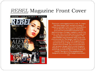
This is my Rock Music Magazine cover.
Rock Magazine Name: Rebel
Cover Girl: Hollie Chan
I created my front cover on Photoshop Elements 7. I took many potential shots for my front cover and so I decided to use this one. (Shown Above) This image not only stood out to me more than the other images but the camera angle was very imortant. The camera angle is slightly below eye-level which shows the model/celebrity as being a higher status. The cover girl is more dominant, she is looking down on the viewer. My rock magazine is named Rebel. I was inspired by many rock legends, musicians and songs to come up with the name for my magazine. Rock musicians are rebels along with writitng rebellious lyrics. As a result, I thought this would be a perfect name for my magazine.
I managed to stick to the layout of the magazine that I originally planned along with the choice of colour. Before adding any straplines, I wanted to make the image stand out a little more. As a result, I increased the contrast and decreased the brightness so the hair appeared darker and the overall was much crisper and fresh-looking. I didn't want to make it look completlet airbrushed as I had to stick to the genre of the magazine. Airbrushing the photo to perfection would have made it look more like a fashion magazine.
I wanted to add a few straplines on the magazine on the right hand side, as I had to make room for a bold kicker just below the face of the main image. I added a skyline at the top of the cover, after learning that most of the rock music magaazines use this technique. At the bottom of the magazine cover, I added a colour border to make the images on the layers above stand out along with including the red colour on the magazine to match the straplines. The entire magazine layout and theme was insprired by the rock magazine: Kerrang!
FINAL CONTENTS PAGE
Tuesday, 15 December 2009
Rock Magazine Contents Page!
This is my Rock magazine contents page. This contents page had to be filled with bright colours, pictures and plenty of text in order for it to fit into the genre. A normal contents page would be laid out very simple: There would be titles and simple text. However, my contents page includes much more.
To begin with I included 'the editor's section' which is allocated on the top left hand corner of the page. I decided to add this feature to make the magazine seem more professional as most magazine would include a shoutout from the editor of the magazine. I used my own name as the editor, as I am the creator of Rebel magazine.
I made sure to make the titles stand out, making it clearer for the audience. I also made the actual contents on the page stnad out by highlighting certain words in yellow, contrasting it with the black background. For the main part of the text, I changed the colour to white making it much easier and clearer for the audience to read.
On the right hand side, I decided to explore photoshop and use a range of different skills to create something that looks a little more interesting in order to lay the photos on the page. Instead of just arranging my photos on the side of the page. I wanted to make it look like a pile of photographs/a stack of photographs on a notice board. I simply overlaid many images on top of each other and edited a photo of a paperclip to make it look more realistic as if the images are being held together.
I used this technique for the right hand side of the contents page. By creating this effect, making it look like there are more photos underneath also gives the message to the audience that there is much more to offer in the magazine. There is a lot in the magazine for the audience to look inside and discover.
For the rest of the magazine, I decided to find some photos that would be featured in the magazine. One of the examples: Using a photo of Fall out boy, showing that there is an article inside the magazine which has been published about them.
Other small features on my contents page such as the quote below the contents titles were inspired from other rock magazines such as Kerrang!
FINAL DOUBLE PAGE SPREAD
I decided to stick to the idea of doing an interview for my double page spread. I wanted to be able to use the original shots I took for the magazine. I based the interview around the celebrity on the cover as this would be the main feature of the magazine. This would be the main story that my target audience is interested in. The interivew was exclusive and so this was advertised on the skyline of both pages. This will make the article in the magazine much more appealing to the audience as this interview cannot be found in any other magazine.
The main colour I used on my double page spread was black as it not only matched the colours my model was wearing but it fit into the theme colours on my magazine. I decided to use the other two colours (Red and Black) that were suggested by the group who took my previous survey. After changing the colours, I realised that the double page looked a lot more eye catching to the reader.
I used a quote taken from the interview as the title of the magazine which catches the reader's attention - influencing them to read the whole interview. This article included a lot of text so I had to make it of an appropriate size. To make it readable, I made the writing white in order for it to contrast in the right way against the black background. For the questions to stand out more from the answers, I highlighted them in yellow. This also makes a certain question much easier to find. To separate the page and prevent it from looking crowded, I separated the pictures from the text by using a thick bold red line/box. This also added a little bit of simple decoration to the page along with it complimenting the photograph that was used for the 'celebrity photoshoot'.
Subscribe to:
Posts (Atom)